
Project Team
design: George Livissianis
builder: Paragon Constructions
Suppliers
furniture maker: Jonathan Ingram, Inde Studio


The Apollo is the first venture of Jonathan Barthelmess in partnership with Longrain’s Sam Christie. This Australian Greek restaurant draws on their shared heritage and professional success, with a keen eye for detail and the flavours of the Mediterranean.
Simplicity, freshness and an absence of pretension are the essential ingredients of The Apollo’s promise. The mythical implications of its name are about quality, innovation and nostalgia.
Apollo was the ancient Greek god of many things. His portfolio included light, music, poetry, healing and the business of predicting the future. He was the coolest, best-looking god on Olympus, the
epitome of control and common sense. He was honest and he understood a good time!
The architect responsible for the fitout is George Livissianis. He’s known Jonathan since they were kids. He’s created something that’s
beautiful in the same way the Greek landscape is: a kind of dusty, engagingly simple setting with divine and challenging touches. There’s honest, rough concrete, but there’s also granite, a little brass detailing and the subtle shock of colour.
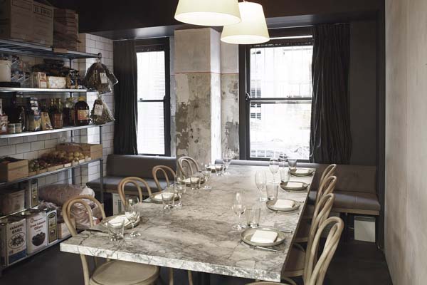
The elegantly minimalist refurbishment includes both banquette and outdoor seating, and a chef’s table sitting adjacent to the kitchen — not unlike the family dining table, as a transition between dining room, kitchen and pantry.
The simplicity of the space is in its balance of rawness and refinement created using a dusty pallete that emulates the rocky greek island landscape rather than the predictable blue and white. The finishes are simple, naked & de-saturated in colour.
This detail is also present in the dining bar, with a long, low proportion to exaggerate the sense of volume within the space & the matt granite top adds a level of sophistication & strength.
As you follow the cement sheeting through to the kitchen the granite central bench, tiled walls and exposed utensils suggests the idea of a family kitchen. And not dissimilar to the family dining table, the chefs table sits adjacent to the kitchen & is a transition between dining room, kitchen and pantry.
In the dining room, the furniture was selected and designed to feel light, the banquettes are free standing furniture & the soft palette is present in the finish of the bentwood chairs – a hand applied soap finish that leaves them as true to their raw state as possible. The curtains and mirrors balance the roughness of the façade walls, while the light quality from the parchment lamp shades renders the space with a sense of calm & warmth.
Added to all of this is a subtle highlight of neon pink – a homage to the re-occuring use of red in Greek imagery sourced during the concept development. The red highlight colour traditionally sourced from newsprints dating to 1939, signage, floral prints and traditional dress has been reinvented into a neon stitch detail in the banquettes, a datum line around columns, and forms the ‘pop’ colour in the graphic branding of The Apollo.