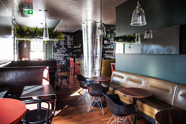
The team behind Summer Hill’s popular One Penny Red restaurant have completed a long awaited expansion with the level-one opening of their new concept Vernon’s Bar.
Located in an amazing Queen Anne Federation building designed by NSW State Government Architect Walter Liberty Vernon in 1901. (He also designed the Art Gallery of NSW), Vernon’s Bar is on the First Floor of Old Summer Hill Post Office built 1901. A beautiful feature is the First Floor Balcony
The ambience is cosy, relaxed, inviting, a little bit sexy yet accessible.
The owners had designers help them with spatial zoning, a booth/banquette design and overall furniture placement, to maximize the space. Colour palate guidance.
The aim of the renovation was to redesign the upstairs bar creating a specific space very different and contrasting to the restaurant downstairs. The aim was to create a space that had its own identity where people could drop in, any night of the week. The space was designed to be available for a quick pit stop or a long night out. They also have just had the balcony become available for late night trading until 10pm. Previously it was only available until 8pm under the conditions of the original DA.
The owners knew how the space worked but the aim was to create a more intimate and cosy atmosphere. They also created a private dining room by moving the office off site. The private room also has doors that lead onto the balcony and this has resulted in creating a great flow of the whole bar area.
The owners had the existing bar structure that included wall and ceiling panels incorporating acoustic paneling and also a custom moulded and built zinc column in the center of the room. They then added to this with spatial zoning incorporating suspended shelving, pendant lighting and a variety of tables. The planning of the space, with the help of the designers took a couple of weeks, then they had to source and order the materials. The renovation itself is all in the planning.
“We had a great start point with the bar already having many outstanding elements of brass, zinc, ironbark floor boards,” said Nina. “It was just a bit cool though. All the walls were bright white so the first thing we needed to do was make it darker and moodier. I had a colour in mind but our designers pointed out it was still a “cool” colour. The designers suggested nimrod (dark green) for the main area, maximus (midnight blue) for the private room and ¼ strength maidens blush which is pink for the hallway. The maidens blush is fun and the other colours we are delighted with.”
The inclusion of a new large booth has really allowed the zones to be created. It’s the centre piece of the room, without being obvious. The booth along with a small suspended shelf and the inclusion of some high tables allows the room to offer different experiences.
It has been pointed out on too many occasions how important the lighting is: the colour of the light, the fittings, the height of the fittings. Nina wanted soft lighting of course for the bar, but enough so customers can still read the menu. She found the lights on a website in the US that doesn’t ship to Australia so she had them posted to her friends Mum’s house in Michigan who the couriered them over.
Nina brought simple glass picture frames from Pentimento Newtown; they hold First Day Covers, old stamps from her childhood stamp collection with her Dad, and letters that date back to 1939. Many were donated by a regular customer who has also gifted the restaurant original framed sheets of the One Penny Red. Obviously this ties in beautifully to the post office.


