The Importance of good venue signage
Firstly, let’s clear up one thing – this article does not touch on digital signage. That will feature in its’ own mega production soon.
In this article we’re talking about traditional signage for your venue such as logos, street signs, direction signs etc.
When walking around town, what lures you into some venues and keeps you out of others? The design, the lighting, and the custom signs all probably have a lot to do with your interest in going inside.
A good sign has to stand out and grab a passerby's attention, even if they are speeding, talking on the cell phone and tending to kids in the back seat. Or in some cases they are doing it all at once.
Custom signs seem so simple at first. Just plop a sign in front of your business that bears your name and people will know where you are. True, custom signs do perform the practical function of letting people find you, but you want more than that! You want people to notice you, have curiosity about you, respect you, and most importantly, remember you.
A Bad Custom Sign
Bad custom signs are ones that have too many words. Many people think that filling up a custom sign with text not only explains their business's mission but captures their interest as well. Not so.
If your custom sign says too much, not only will people be slowed down trying to digest all you are trying to say, they will lose interest before ever coming inside. Keep custom signs short, sweet, and to the point.
Bad custom signs are also ones that have too many graphics. If your custom sign appears busy and cluttered, guess what that says about your business? You may have wonderful artistic vision, but save it for your business and keep graphics to a minimum on your custom sign.
Bad custom signs are signs that are not placed properly. You want your custom sign to attract business, so place an appropriately sized sign in a spot that yields optimal exposure.
An Ugly Custom Sign
Even if you follow the guidelines to avoid a bad custom sign, you could end up with an ugly one. How is this possible? Well...
Ugly custom business signage is the kind that's made of materials that can not stand up to the weather, therefore leaving them faded and battered after prolonged exposure outdoors. Who wants their business to look worn and torn?
For example, vinyl banners are great for temporary events, such as sales and grand openings. However, if you plan to affix a vinyl banner permanently on top of your large building, it would last for a while but eventually look a little wind-beaten. A strong, heavy-duty performance sign is a more appropriate choice for a permanent, mounted custom sign.
What about hand-painted wooden signs often seen in front of a lot of independently-owned businesses? They tend to fade and rot after a while, not to mention they just don't look as professional as custom designed sign.
Ugly signs are also ones that have bad use of colour. Often, many businesses have signs that use no colour, just black and white. This can look attractive and professional if the lettering and graphics are of high-quality, but a little colour never hurt anyone. And too much can hurt everyone. Select a few colours for your custom sign that are appropriate for your type of business but make it stand out from the others.
A Good Custom Sign
Construction: A good custom sign is first and foremost constructed out of appropriate materials. This can be metallic, timber, plastic, vinyl, LED or neon.
Colour: A good custom sign uses colour to its advantage. Colour is a powerful tool in attracting the eye - let it speak for your business. Colours should contrast well. Not all custom signs need colour to be attractive and appealing. Many signs use black on white or white on black for a contemporary, professional look. However, market research shows that using at least two different colours increases retention of an image, so while you do want people to notice your custom sign, you also want people to remember it.
Avoid using colours that are so close in shade or tone that they blend into each other, such as gray on black or green on dark blue. Even if you use white on black, at least your’re providing contrast in your custom sign. Contrast is essential to grasping the text on your custom sign because it awakens the eye rather than fatigues it and allows people to focus instead of search for a message. This may sound like over-thinking something small, but consider that viewers have only 3 1/2 seconds to read a sign - you want to make those few seconds count as much as possible.
Using a border around your custom sign in a contrasting colour, such as black around a white background, also provides an opportunity for your custom business signage to pop out. This simple addition to your custom sign brings viewers directly to your message and also increases memory retention.
Size: A good custom sign had a well-balanced shape and size. Size matters - in most cases bigger is better. Your sign can be seen from further away and you have room to convey more information without overcrowding the sign. Those 3 1/2 seconds don't afford viewers a lot of time to digest a lot of information, so keep your message concise and to the point. A simple name and maybe a slogan is all that is needed on most custom signs. If you want to say more, then try to do it in a graphic, but stay away from a cluttered custom sign that will distract from your message rather than attract potential business. After all, your custom sign speaks for your business, and you want to deliver a message of efficiency.
Design: A good custom sign has simple, eye-catching graphics. A logo or image should be unique, simple and readable from a distance. Text size and font should simple and clean and again large enough to be read from a distance at speed. An image or logo on your custom sign that helps brand your company not only adds personality and originality to your business, it also gives people a mental association. Think about it - when giving directions, don't you almost always use a sign as a landmark? And doesn't that sign usually have a graphic on it that you mention? Images along with text make for memorable custom signs. And adding a photograph to your custom sign is even more effective in allowing readers to remember your business, and it is just as easy to add to your custom sign as any other image. Effective use of intuitive symbols and shapes can help express your message as well.
Colour and shape are particularly important for signs out on the street. Different colours create differing reactions to the human brain, and different shapes create different reactions. For example, a triangular sign has points and represents danger, which is why the shape is used for warning signs. Rectangular signs are the same shape as a book therefore, they give information. Round signs are instructional because they look like the end of a pointing finger giving you an instruction.
Symbols which are easily recognized around the world, are extremely important to convey an idea and be understood. Designing a symbol to effectively translate information to all cultures and languages is difficult, but it is possible. When you research symbols used by designers you can see that sign symbols evoke similar responses in different nations and cultures. Similar living experiences, and memories are the base of understanding symbols, and culture is the common thread between a designer's ideas and the viewers understanding. This being said, our complex world is comprised of a handful of some very simple design patterns. Patterns are made of basic shapes. These shapes have found their way into human design since the beginning of our time because they tell an eternal tale in a glimpse and their structure instructs us about our connection to the universe. Symbols are intuitive and immediate. Designs that reference these symbols create an immediate relationship with the viewer.
Legality: A great sign needs to first comply with local bylaws or it will be removed. So check with your local authorities.
|
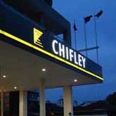
CASE STUDY 1
|
Chifley Hotel
with First Neon
|
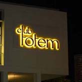
CASE STUDY 2
|
Totem Club
with fremont design
|
CASE STUDY 3
|
Royal Cricketers Arms
with Colorado Dimensional Signs

|
It is interesting that Westfield until recently used to have the word SHOPPINGTOWN under its WESTFIELD - well they now have a program to remove the former. So their centres are now simply
Westfield Chatswood etc. These businesses can get away with not saying what they do as their audience already knows; their message has been pounded into us - and well done to them. |
Turned on businesses will revisit their signage every 5 years (that is if they survive) as leases usually run 5 years + 5 year option - so this is the time to revitalise the business. |
Clients will be confused by cluttered signage with too many messages as our brain just turns off and doesn't bother . Also if it is the same sign, same place, same colour, same, same same - well, we just don't see it anymore. Also too many signs or too much information on a sign - our brains just get confused. |
There are too many businesses with such subtle signage (usually designed by people who don't like signs) that their potential clients do not know they are where they are or what they do! |
|